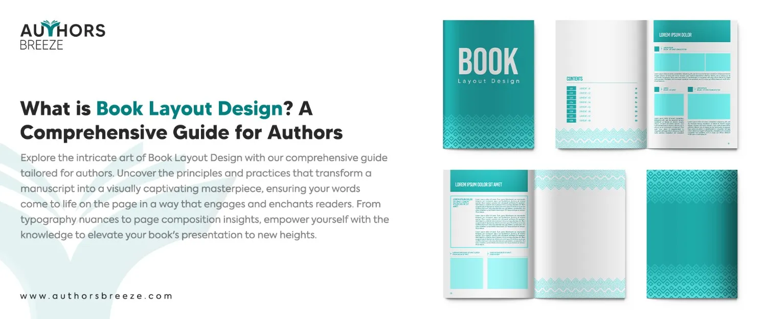
Book layout design, often known as typesetting, refers to the designing the interior of the book. It is where you choose to create your book that will affect how people feel when they read your printed book. This includes crucial decisions like picking the right fonts, deciding on spacing, designing chapter headings, and setting margins.
As an author, you should know the intricacies of the book, such as the interior, and we are here to guide you on that. After the outer elements of the book, such as the book spine, book jacket, and book cover, the most critical aspect is the interior. The interior of a book includes a lot of things, such as an acknowledgment page, but we will focus on the book layout design specifically.
Readers of fiction or non-fiction pay great attention to the interior of the book as it is the content that matters the most to them. In this blog, we will discuss the importance of book layout design and how to typeset a book.
Importance Of Book Layout Design
Enhanced Readability
A quality book layout design contributes to significantly improved readability. It ensures that readers can easily follow the flow of text and absorb information without any issues.
Reader Engagement
Layouts that are engaging and aesthetically pleasing gain the attention of the reader. This can include well-chosen fonts, spacing, and images. All of this combined can enhance the overall reading experience and encourage the readers to stay immersed in the contents of the book.
Conveying Tone and Mood
One of the benefits of a great layout is that it helps convey the tone and mood of the book. The color schemes and typography can be used to describe the intended tone and mood of your book while allowing the reader to understand everything easily.
The First Impression
The cover surely adds to attracting the readers, but it is the interior layout that keeps them engaged. As an author, you need to pay attention to a book layout design. This can highly contribute to the overall aesthetics of your book and set the tone for the reader.
Readability
The book layout design also helps improve the readability. From font selection and size to line spacing and margin width, it all contributes to the enhanced readability of the book. All of these factors influence the overall comfort and experience of the reader.
Design a Professional Book Cover
Ready to transform your book? Contact us today and let us create a book cover that captivates, inspires and helps you sell your book!
Key Elements Of Book Layout Design
Typography Mastery
One of the top element of a book layout design is the typography. Choosing the right font, its size, and its style is essential. A non-book person would not pay attention, but a reader would indeed lay their eyes on the fonts and the overall typography.
If you use fonts such as Papyrus and Comic Sans for your main copy, then your book is already going into the trash. You sell your books to readers to read, and they don’t buy them to see how round and edgy the text is. Therefore, it is vital to pick the right fonts.
Page Structure and Grid Systems
A grid system is a framework of horizontal and vertical lines that are used to align and organize elements on the page of a book. The grid provides a structure for the placement of book text, images, and other design elements. It helps maintain visual harmony and consistency throughout the book.
Imagery and Illustrations
Visual elements include images, illustrations, or graphics in a book. Thoughtful use of visuals enhances the reading experience. Proper placement, alignment, and resolution are also essential to maintain a connected and visually appealing book layout design.
How To Design A Book Layout – Tips For Authors
Here are the steps on how you can design a book layout:
1. Page Size And Orientation
Selecting an appropriate page size and orientation sets the foundation for a well-designed book layout. Consider the content and genre when you make the decisions. Standard sizes, such as 6×9 inches, are common for print books. Choose the orientation based on the type of your book. Usually, books are in portrait, whether they are fiction or non-fiction. At the same time, art books and children’s books are generally landscape-oriented.
2. Margins And Structured Grid System
Establish well-proportioned margins and implement a structured grid system to maintain visual harmony in the book layout. Margins provide white spaces and prevent the page from feeling crowded. The grid, on the other hand, guides the placement of text, images, and other elements. Consistency in margin widths and a structured grid system contribute to a polished and professional appearance.
3. Typography
Typography is fundamental when it comes to a successful book layout. Choose suitable fonts for body text and headings. Adjust font size and line spacing, and maintain a consistent style to enhance readability. A rightly chosen font contributes to the overall aesthetic of the book.
You can use fonts such as Arial, Helvetica, Avenir Next, or IBM Plex Sans. For a more readable body copy, you can use Garamond, Georgia, and Sabon Next. Nonetheless, whatever font you choose, just make sure it is readable.
For font sizes, follow the rules below.
- Large Headers: 30 pt. or above
- Primary Headers: 16-24 pt.
- Sub Headers: 12 pt. bold
- Body Copy: 10-12 pt. regular
- Footnote/Page Count: 8 pt.
4. Distinctive Chapter Openings
Create distinctive chapter openings to add visual interest. Unique chapter openings help guide readers through the book. You can try different elements such as drop caps, special fonts, or decorative separators to signal transitions. This creates a connected theme for each chapter and contributes to the overall book layout design.
5. Visual Elements
The integration of visual elements, which include images and illustrations, requires careful consideration. Thoughtful placement, alignment, and resolution all contribute to the overall design. Graphic elements should enhance the content, align with the book’s theme, and ensure a harmonious and engaging layout.
6. Color Palette
With images and illustrations, a color palette is essential as well. It helps convey the mood and theme of the book. Colors impact the reader’s emotional response. Therefore, select hues that complement the content and interest the reader. Consistency in the color scheme throughout the layout can enhance your book layout design exponentially.
7. Proofing And Ensuring Consistency Across The Layout
After completion of the initial design, thorough proofreading and consistency checks are essential. Ensure proper alignment, spacing, and font consistency. Pay attention to details such as headers, footers, and page numbers to maintain a professional and error-free book layout. Consistency across the entire layout enhances the overall reading experience.
Format Your Book Perfectly
We format books effortlessly and professionally. Reshape your written ideas into a beautifully formatted book!
Frequently Asked Questions
What is a book layout designer called?
The professionals who are responsible for designing the layout of a book are known as "book designers" or "book layout designers."
How do you design a layout?
Pay attention to the following things for the best book layout design:
- Size
- Binding
- Outline
- Margins & bleeds
- Typography
- Body copy
- Images
What makes a good book design?
A good book design means that the reader gets lost in it and is not aware of the pages in the book. A good book design includes appropriate font, font size, appealing graphics, and other such elements.
How many words are eight pages double-spaced?
The number of words on eight double-spaced pages can vary depending on factors such as font size, font style, and the specific formatting. However, as a general estimate, a double-spaced page typically contains around 250 to 300 words. Therefore, eight double-spaced pages might have approximately 2,000 to 2,400 words.
How to format a novel?
To format a standard novel size, keep the margins roomy, choose legible fonts, and use a comfortable novel font size. Here is a detailed guide on How to format a novel.
What is a typical book size?
The typical mass-market book trim size is 4.25 x 6.87, and trade paperbacks range from 5 x 8 to 8 x 10.
Conclusion
To summarize the key takeaways from this guide, your focus should be on the overall design aesthetics of the book layout design. As an author, think of your readers and your audience. Make every decision thoughtfully while considering your readers. Take book design inspiration from other books, too, for a better idea.
Choose the correct page size, fonts, and size. Keep the standard book margins consistent and follow a structured grid system. Choose unique and engaging chapter openings, and use outstanding visual elements and the right colors. After you are done with everything, check for any mistakes, improve where there is any space for it, and finalize it. You can also use book layout software to organize page layout, rotation of pages, etc.
Invest time and effort into thoughtful book page layout, as this can elevate your work and leave a lasting impression on your readers. You can also employ Authors Breeze for book layout design. We implement the best practices.


